The Lira Symbol: we designed a mark for the Syrian pound
Every major currency has a symbol. The Syrian pound has a spelling. So we drew one, shipped it in Dealio and Ziko, and made it free for everyone to use. Here is the thinking, the rules, and the download.
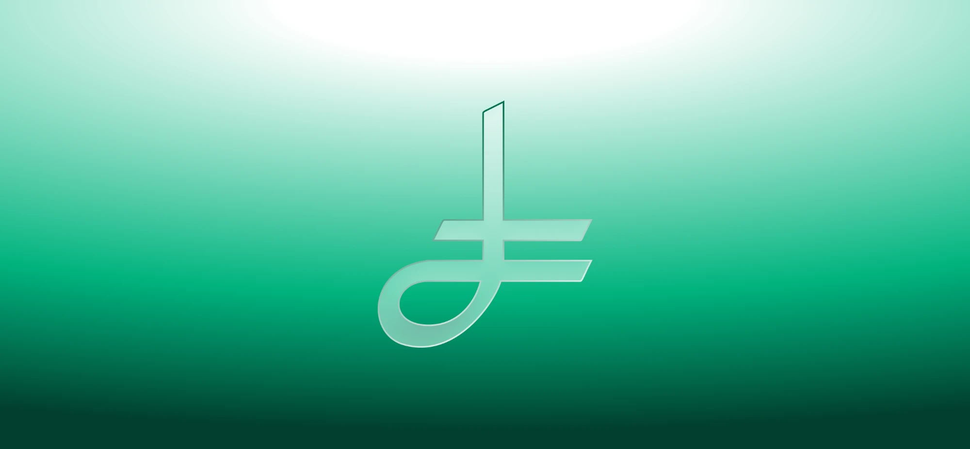
Every currency you can name at speed has a mark. The dollar has $. The pound has £. The euro has €. The Turkish lira has ₺ and the Indian rupee has ₹. The Syrian pound has a spelling. In Arabic we write ل.س, in English we write SYP, and inside most apps we write nothing at all and hope the surrounding context does the explaining.
Today we are publishing a symbol for the Syrian pound. We call it the Lira Symbol. It is free for anyone to use, it is already running inside two apps we built, and the full kit is downloadable at the bottom of this page.
A currency symbol is infrastructure, not decoration
It is tempting to file this under branding. It is not. A currency mark is a piece of writing infrastructure, and the countries that have one got something the rest of us keep paying for in small ways every day.
Start with the practical problem. ل.س is three characters and a full stop. SYP is three more. Put either one into a price column on a phone screen and watch what happens: the number you actually care about gets pushed around, the column stops aligning, the label wraps onto a second line, and a designer somewhere quietly deletes the currency entirely because there is no room for it. That is the real state of Syrian pricing on screens today. The currency is either shouting or missing.
A symbol solves that because it is one glyph. It sits tight against the number, it aligns down a column, it survives being set at 14 pixels in a receipt row, and it reads before you have finished looking at it. That is the whole trick. A good currency mark is understood faster than a word can be read.
There is a second reason, and it is less about pixels. A symbol is a small act of confidence. It says this money is a normal currency in a normal country, written the way the world writes money. Syria is rebuilding a great deal right now. This is a piece of that rebuild that costs nothing and belongs to everyone.
What the mark is made of
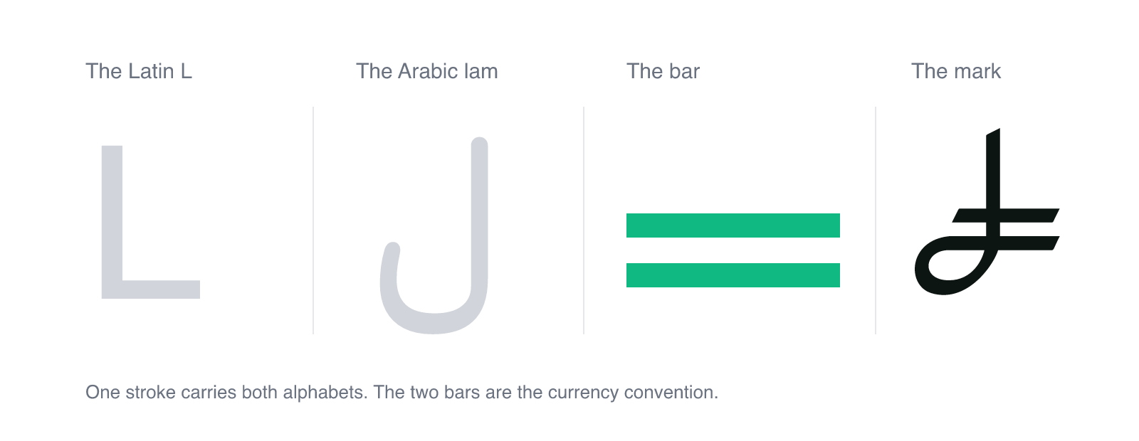
The Syrian pound is written in two scripts every single day. Arabic on the note, Latin on the export invoice. Any mark that only nods to one of them would be picking a side, so the shape had to carry both at once.
The stem and the curve are a Latin L and an Arabic ل in the same stroke. Read it left to right and it is an L. Read it as Arabic and the tail of the lam is right there in the loop. Nothing is bolted on, it is one continuous gesture that happens to be legible in both alphabets.
The bar across it is the piece that does the most work. Two horizontal strokes through a letterform is the oldest convention in currency design, the thing that turns a letter into money: it is what separates the euro from a C, the yen from a Y, the pound from an L. Ours also carries a meaning we chose deliberately. It marks a line drawn across a new era for the Syrian economy.
The angled cuts on the ends of the strokes come from the Syrian emblem. It is a quiet detail and most people will never consciously notice it, which is exactly right. It means the mark is not a generic shape that could belong to any country. It came from here.
How we drew it
The constraints were set before the first sketch, because currency marks fail in predictable ways.
- It has to survive 14 pixels. Most of the time this symbol will appear small and grey next to a number, not large on a poster. Anything with delicate counters or thin joints closes up and turns to mud at that size.
- It has to work in both directions. Arabic interfaces run right to left, Latin ones run left to right, and the same glyph has to look correct in both without being mirrored or redrawn.
- It cannot collide with a symbol already in use. It had to be unmistakably not the pound, not the euro, not the Turkish lira, not the rupee.
- It cannot look like a logo. A logo belongs to a company. This has to feel like a letter, something that belongs in a font next to the digits, not a badge sitting beside them.
Everything after that was subtraction. Early versions carried more of the emblem and more detail in the loop, and every one of them died at small sizes. What survived is close to the minimum: one stem, one loop, two bars, four angled cuts. When we could not remove anything else without losing the L or losing the lam, it was finished.
Then we did the test that actually matters. We put it in front of Syrians cold, at the size it will really be used, with no explanation. Not "do you like it" but "what is this". When people read money without being told, the mark is doing its job.
It is already live, in two apps
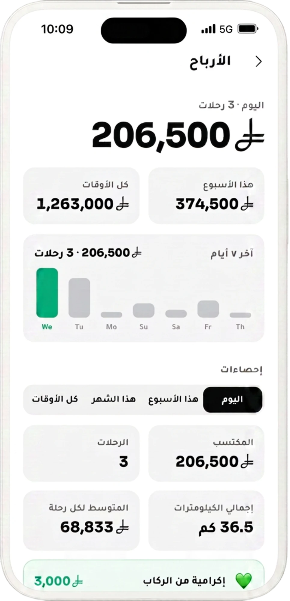
A symbol nobody uses is a picture. So we did not announce this one and wait. Dealio and Ziko, both built and operated by Innoveev from end to end, are the first apps anywhere to publish the Lira Symbol in production. Every price in Dealio and every fare and earnings figure in Ziko is now written with it, in Arabic and in English.
That matters more than it sounds. Symbols do not become real by decree, they become real by repetition. A driver who checks his earnings every evening sees this mark several times a day. That is how a shape stops being a proposal and starts being how you write money.
The rules for using it
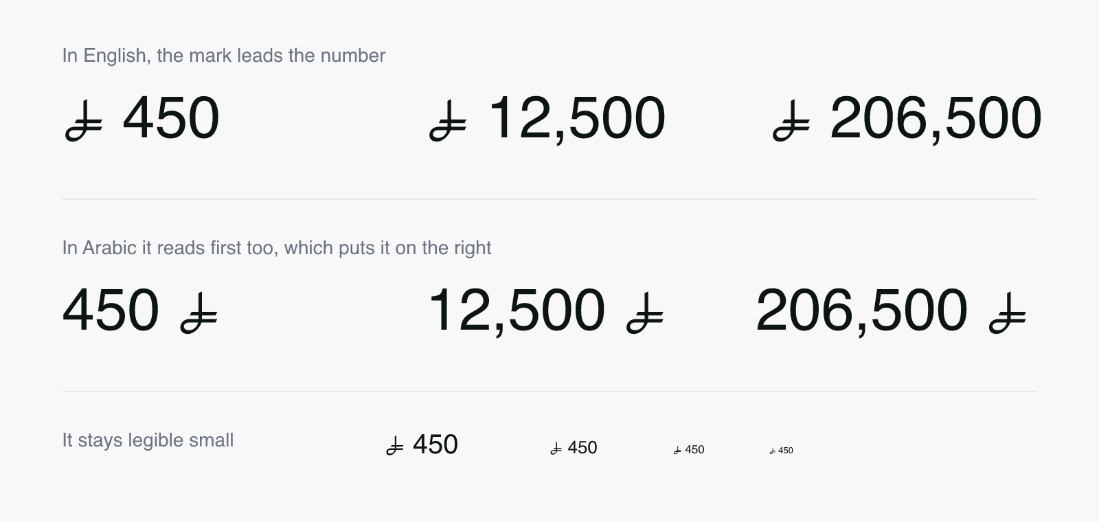
The mark leads the amount, the way $ and £ do. In English that places it to the left of the number. In Arabic it still reads first, which places it to the right. Keep clear space around it of at least half its height, never set it below 14 pixels on screen or 4 millimetres in print, and use one flat colour with no gradients, shadows or outlines.
What you must not do: redraw it, stretch it, squash it, rotate it, put it in a box like a logo, or present it as an official symbol of the Syrian state. Scale it and recolour it. That is the whole permitted range, and it is deliberately narrow, because a symbol that everyone adjusts slightly is a symbol that stops being one symbol.
For developers
The kit includes a real web font containing a single glyph, mapped to the Private Use Area codepoint U+E000. It is under 1 kilobyte in WOFF2, so it costs nothing meaningful to load.
Two cautions worth taking seriously. First, always pair the glyph with a text label, because a Private Use Area character means nothing to a screen reader and it will announce silence to a blind user. Give it a role of img and an aria-label of "Syrian pounds". Second, keep the character in your presentation layer only. Store the amount as a number and the currency as SYP, and never write U+E000 into a database, an export or an API response, because outside your app that codepoint is meaningless. Full snippets are in the README inside the kit.
How a symbol like this becomes normal
This is not the first time a country has decided its money deserved a mark. India ran a public competition and adopted the rupee sign in 2010, a design by D. Udaya Kumar that fuses the Devanagari letter ra with a Latin R. Turkey did the same and adopted its lira sign in 2012. Both were unfamiliar on the day they launched. Both are now on keyboards, in fonts and on shop windows, and neither took a generation.
What those cases have in common is that the mark shipped before it was famous. Somebody had to put it on a price tag while it still looked strange. That is the part we are volunteering for.
We are open about where this sits. There is a formal path into Unicode, the standard that eventually puts a symbol on every phone keyboard on earth, and we have not submitted anything yet. It is firmly on our list. But the order matters here, and it is worth understanding why.
Unicode does not encode symbols because someone makes a good case for them. It encodes symbols that are already in use, and its own guidelines ask for evidence of usage independent of whoever created the thing. Read that carefully and you will see the position we are in: Dealio and Ziko using this mark does not count. Our own adoption proves nothing to a standards committee, by design. What counts is a shop in Homs printing it on a receipt, a newspaper setting it in a headline, a bank putting it on a statement, a developer we have never met shipping it in an app.
So this is not us announcing a symbol and asking to be recognised. It is us doing the only part we can do alone, which is drawing it, proving it works in production and giving it away properly. The rest is genuinely not ours to do. If it gets used widely enough to deserve a codepoint, the case will make itself, and we will happily file the paperwork.
Take it, it is yours
The kit is free: the mark in SVG and PNG, black and white, the web font in WOFF2, WOFF and TTF, a README with the rules and code snippets, and the licence in Arabic and English. Use it commercially, use it in software you sell, use it anywhere. Do not sell the symbol itself, do not alter it, and credit Innoveev where you would normally credit a typeface.
If you are a bank, a ministry, a newspaper or a shop owner and you want to use it, you do not need our permission and there is nothing to sign. Download it and start. And if the Syrian government one day decides this should be the official symbol of the Syrian pound, it is theirs. That was always the plan.